A webapp without frameworks
Every know and then, front-end developers talk about "Framework fatigue" and classics like vanilla-js.com are passed around. While npm, webpack etc. have there place, it can feel bloated, abstract and fragile to work on projects that rely on tools like these. Will I be able to quickly fix a small thing in a year without upgrading dozens of libraries and tools?
The project
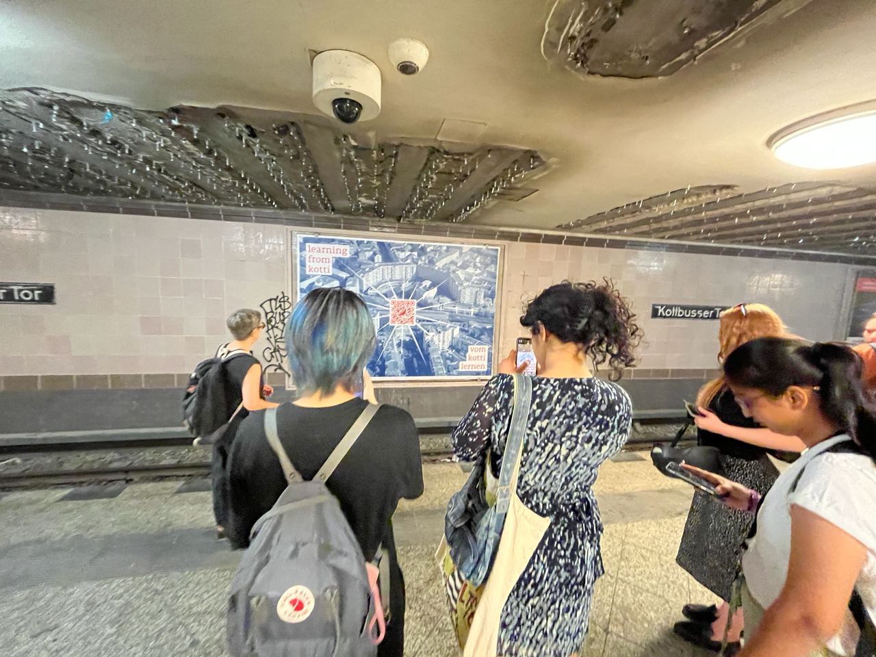
For many years I am member of the social tenant's organization Kotti & Co.. The associated legal organisation Kotti Coop executed a project on New Urban Publics, here in Berlin at Kottbusser Tor. For this project, I developed a little web app that could be accessed by scanning a QR code that was shown at a subway station in Berlin-Kreuzberg.

This is what the app looks like:
The main constraint of the project was limited time and budget. My daughter was born right in the middle of the planned implementation time, pushing the project far in the background for me. Also, the website was only part of a larger project, mainly executed in real life, limiting paid dev hours and hours to discuss project details.
The consequences:
- Between proof of concept and final implementation, I did not start from scratch with a clean architecture, but iterated on what I already got.
- I did not bother JS frameworks or build steps, but worked directly in vanilla JS and hand written CSS
- Content must be editable by non-tech people, even if we do not have the time to implement a whole editor section
The slides
The slides are li elements, displayed as fullsize grid. When the user drags the grid, it moves by changing the transform property. You can see the basic mechanic here.
The slides are constructed by fetching a JSON with the content description, that is a description of each slides' texts in english and german and images and their CSS classes. Then we loop over the slides and create the list elements. Originally, the intention was to let the designers work directly in the content JSON file, but the feedback loop of editing in text editor, uploading via FTP, refresh in browser was too slow. So we did something else:
Editing UI
While the website is behind a lock screen that encourages visitors to visit the site from their phone by scanning the QR code, a keyboard shortcut bypasses the gate, so the editors could access it on their computers. Another shortcut activates a very minimal dialog, where they can edit up to three texts (in german and english) and up to three images per grid tile. Formatting is done by assigning CSS classes from a list of possible values (e.g. "w200" stretching across two slides or "bottom-left" to align a text). The changes trigger immediately a refresh of the website, so the feedback loop is quite fast.
Once satisfied with everything, they can hit
As you see, this editor UI is super basic, but it works.
Caching
Since this website is mobile-only and relies completely on the most important mobile input gesture, the swipe, we made it an Progressive Web App. You need not much more than a manifest.json and a service worker, that acts as man in the middle for all network requests and should handle caching, offline situations and everything else that differentiates a website from an app in regard to networking.
The whole website is heavy, almost 9 MB. We do not know where the user swipes on the two-dimensional grid, so we have to fetch all images before the user can start. When constructing the slides from the content.json, we store the image URLs temporarily like so: 
imgs and download them:
const preloadImage = src =>
    new Promise((resolve, reject) => {
      const image = new Image()
      image.onload = resolve
      image.onerror = reject
      image.src = src
  });
Every fetched file will be cached with the service worker, so this has to be done only on the first visit of the website. When all images are preloaded, the progress bar reaches 100% and the entry page disappears.
What to do next with it?
The core idea is great, a lot of people spend multiple minutes standing in the station and swiping through the slides. So what could be improved?
First, the UI to edit content is not very nice. Content formatting class names should be a drop down, not freetext. The number of text and image elements should not be fixed to 3, but variable (although three was always enough).
Clickable elements (e.g. the language switcher on the start panel) break the overall dragability of the slide. I did not have time to investigate this, but this should be solved in a follow-up project.
The size of the grid and the order of the slides is fixed. Both should be changeable.
Image upload would be nice. At the moment images must be uploaded manually via FTP and then referenced by filename in the UI.
It would be nice to have a more responsive design that deals with landscape mode (maybe two slides next to each other?) and desktop.
The loading screen comes up shortly even when all images are cached. Also, in web-app mode with everything cached, we still need an internet connection. And the images are still very big.
Architecture-wise, the different components are not as isolated as I would like. I would try out custom event emitters and listeners next time.
Overall, it was a fun project and I really learned to appreciate the raw, immediate mode of working without any framework. I would definitely do it again on a project of this scope.